Did you know? If companies slightly altered their logos, they would save millions of dollars in production costs and substantially lessen their ecological footprint. Few businesses have considered doing so, however, as marketing is all about visibility and ensuring a brand is seen.
Fortunately, examples of possibilities have already been created. As DesignTaxi reports, Ecobranding concept is a conceptual experiment aimed at making brands more eco-friendly. It is appealing to companies due to the financial aspect and environmentalists because of the benefits simplistic logos would provide.
From McDonald’s and H&M to Apple and FedEx, a few design tweaks can go a long way. Following are 10+ examples of what iconic logos would look like if they were eco-friendly:
Believe it or not, printer ink costs twice as much as Chanel N°5
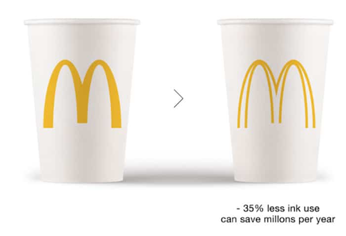
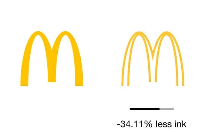
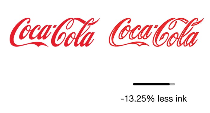
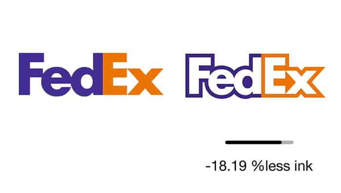
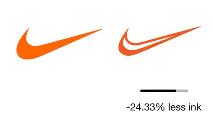
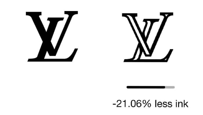
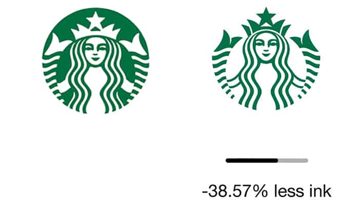
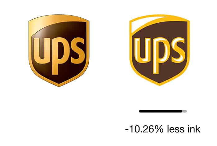
Ecobranding aims to reduce that cost by using less ink in logos
Using less ink will reduce the environmental impact of printing millions of logos
1) McDonalds

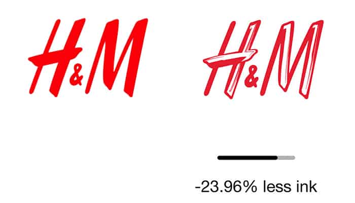
2) H&M
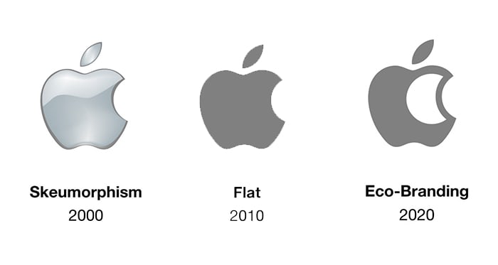
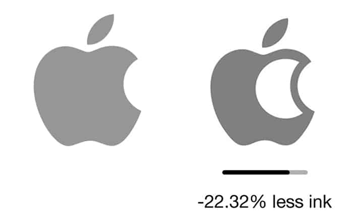
3) Apple
4) Coca-Cola
5) FedEx
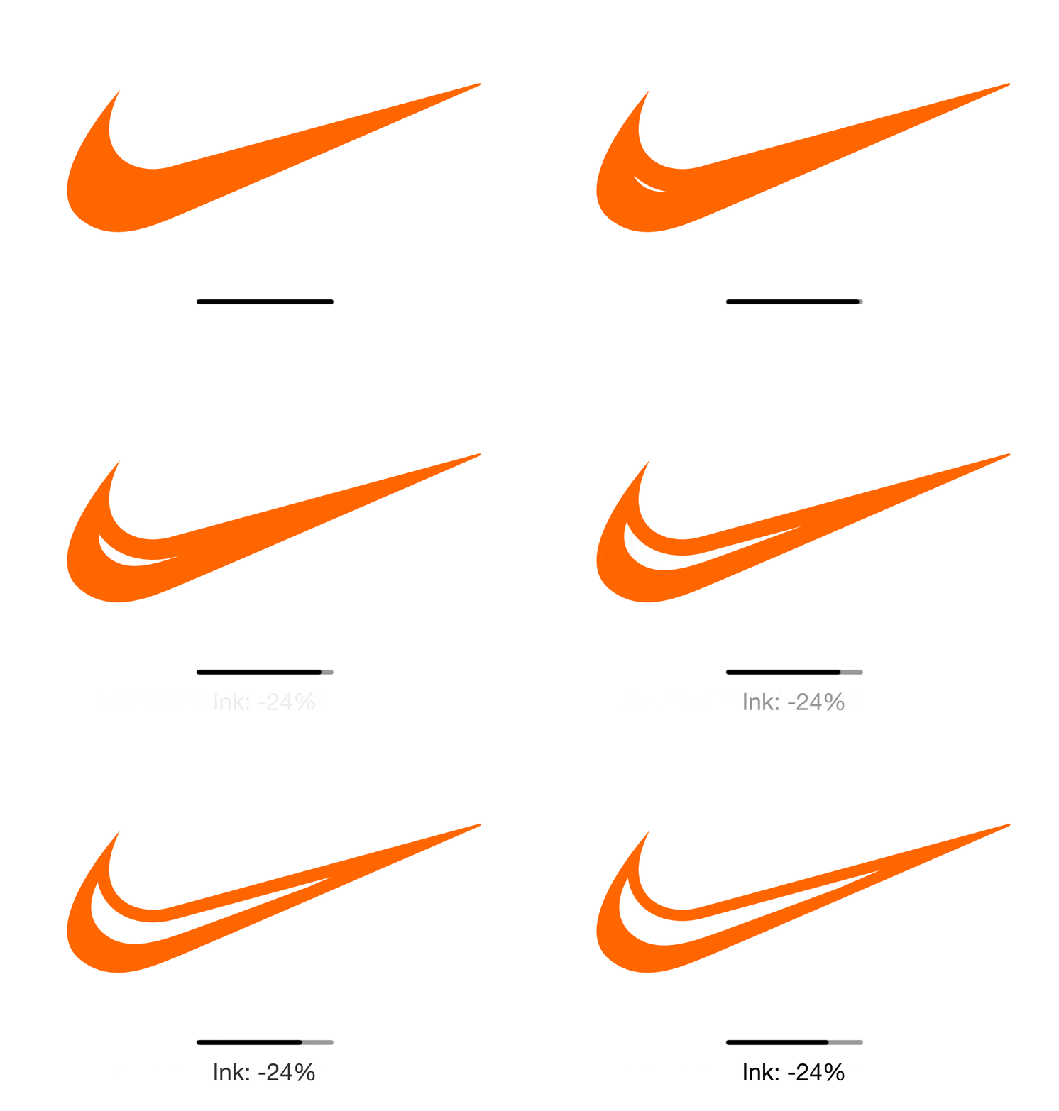
6) Nike
7) Luis Vuiton
8) Starbucks
9) UPS
Via Design Taxi, Bored Panda
What are your thoughts? Please comment below and share this news!
